Please login to rate or comment:
| Comments on this picture (9): |
|---|
|
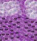
1. Lillie wrote: If anyone dares please tell me what I could do to make this pic. better I came to a blank:( |
|
2. skynyrd wrote: Try increasing and decreasing the parts. Like the picture You doing good |
|
3. Shanley wrote: very dynamic pic |
|
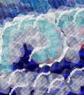
4. Shanley wrote: Lillie, take a look on the forum in Marius's water collection. I think you could find some good examples there. Also, Shosho has a good pic of waves. This is not bad at all, I'd siply not use those flowers separately. |
|
5. Shanley wrote: Either get some foam with them, or just take them out....that would be my option.. |
|
6. Lillie wrote: Thank you everyone for your kindness and great suggestions! I think I will start a new one so I can learn form this one and see what I am doing! Thank you again!!!! It really helps! |
|
7. chelydra wrote: a picture is what it is, and once the underlying form, in other words the overall design, is in place, that's that. What you did here looks like a cross-section of a wave. It's a view we know must exist in theory but can't ever see... |
|
8. chelydra wrote: ...from the beach, from in the water, or from the sky. But that doesn't mean you shouldn't draw it! But once you have that as your underlying structure it's hard to suggest what to do with it, since we've never seen it! If you resort to copying existing |
|
9. chelydra wrote: ...pictures, imagine your way into it - smell the salt, feel the spray, gaze out the sea at the vast horizon. That will guide you better than our advice. |
Please log in to add a comment


