Please login to rate or comment:
| Comments on this picture (17): |
|---|
|
1. nannakay wrote: As always nice pic. |
|
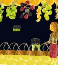
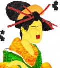
2. Scrivener wrote: I'm much more satisfied with this version... a better articulated hand, blacker hair, redder lips... this old girl's ready for business! |
|
3. sheftali52 wrote: This is simply excellent!! |
|
4. likemee wrote: i agree. they are both brilliant, but this is a slight improvement. in candy the light yellow oval has less shadow than the spherical one and may help you get the contours of the face even better. |
|
5. Scrivener wrote: Likemee, I used that circle for the shadow, suggestive of the nasal bridge. I tried making an orange-wedge nose by layering yellow on orange, but it was too clownish-looking. |
|
6. Birgitta wrote: I like the angle of the head/hair of this one (and the mouth) more, but I like the expression of the eyes (the slant, well...you know..) of the other more. Both terrific! |
|
7. Baldur wrote: wonderful job, magickal if you step back a few paces. Let's hear it for Courtesans, they created a lot more history than world leaders |
|
8. boneymaroney wrote: wonderful! |
|
9. puzzler wrote: True Japanese artistry. |
|
10. hdwildmustang wrote: This is weird...I left a comment here on this picture telling how much I liked it and now its gone, Hmmmmm? Well let me say again...I absolutly love this. Done marvelously! |
|
11. matthew wrote: This is a "do over" |
|
12. hdwildmustang wrote: Duh...now I feel dumb. I see that now matthew. |
|
13. cj07 wrote: I like the changes! It is even more beautiful! |
|
14. qwer wrote: I'm waiting for her to walk out of the frame. Great job. |
|
15. Login wrote: equally as good. |
|
16. miki wrote: amazing ^-^ its done so well. |
|
17. raydog wrote: You are outstanding in your preciption |
Please log in to add a comment
User: Scrivener
Date joined: 17 Nov 2008
Number of pictures: 22
Has a picture in:
![]() Top 5 November 08
Top 5 November 08
Showcases:
![]() Thanksgiving 2008
Thanksgiving 2008


